Affiliate logos
Affiliate logos enable Site Owners/Administrators to display a set of logos of affiliated organisations, funders, etc. in the site's Footer, with the option to link each logo to the relevant website. The Affiliate logo region can be placed above or below your site's footer.

Affiliate logos above the footer

Affiliate logos below the footer
Layouts
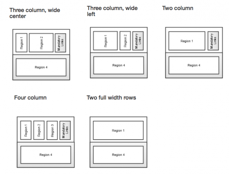
There are five five footer layouts available, each divided into two rows.

The five footer layouts

Footer layout - four columns, Zoology department website.

The CGIS site - two column, wide left footer layout

The IT Services Projects site uses the three column, wide centre footer layout

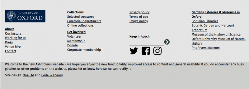
The Ashmolean Museum Footer uses the Two fullwidth rows layout, with a four-column WYSIWYG layout in the top row.
Widgets
You can include more than just text in your Footer, you can place widget in a Footer region just as you would in a page:

The Digital Education @ Oxford site includes a Grid widget in the footer.

The CORe website only have the mandatory content widget in their footer
Powered by Mosaic
All Mosaic websites have a small Powered by Mosaic icon included at the bottom of their Footer.

The powered by region included at the bottom of all Mosaic sites
Background images
Background images can be placed in the Footer in order to provide visual interest. The Botanic Garden and Artboretum site has a background image in the Footer:
As these background images will be overlayed by textual content, consideration needs to be given to the legibility of the text. To ensure text legibility, we recommend that you:
- Use images that are predominantly the same tone (i.e. mostly dark or most light)
- Use images that are either mostly dark or mostly light (avoid images which are mostly mid-tone)
- Set the text colour of the text appropriately (i.e. very dark text on a light image, or very light text on a dark image)
- Once in place, review your background image / text colour combination to assess the legibility